PW Patient Profile
Patient Centered Care
Project Overview
TIMELINE
4 Months
TOOLS
Sketch
Invision
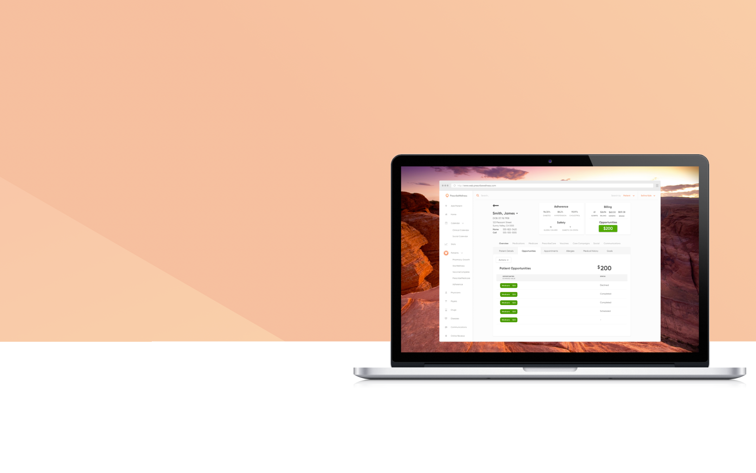
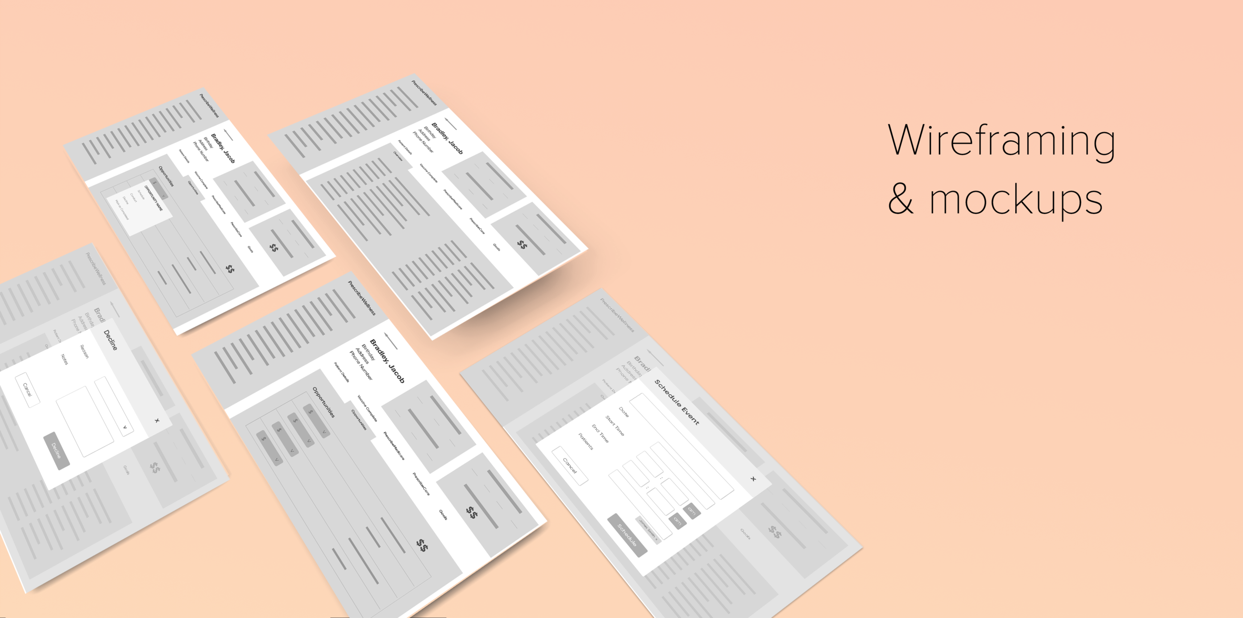
The patient profile houses all of a patient's health information and medication history that could be useful for a pharmacist. In order to help improve patient care and boost pharmacy revenue, we wanted to add an additional section in the patient profile where pharmacists can easily view new opportunities in the pharmacy that patient's are eligible to enroll in.
MY ROLE
UX Designer, UI Designer, Information Architect
Defining the Scope
Project Goals
Easy way to view patient opportunities
Give users an incentive to look at opportunities
Perform an action for each opportunity
View the status of the opportunity
Project Limitations
Must fit within a small container
Not all patient opportunities have the same behavior
Research & Define
INSIGHT INTO OUR USERS
I spoke to 2 of the internal stakeholders and product owners in this process in order to get a better understanding of the business needs and goals. Speaking to them also helped me learn more about the users who are using our patient profile dashboard.
Meet John Wilson…
John is the lead pharmacist who has been working at Health Mart Pharmacy for over 10 years. He likes his routine activities, and finds technology platforms more confusing than helpful.
“I would rather use an outdated program than learn a new one because I’m more familiar with it”
Design Strategy
Comparing my initial designs
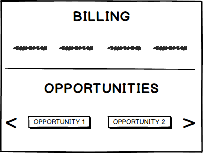
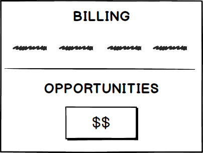
I designed 4 different ways to display opportunities: Version A, Version B, Version C, and Version D. Each of these designs fulfilled their own important criteria in the comparison chart below:
Understanding the Hierarchy
I met with the product managers and internal pharmacists to get an idea of which opportunities they thought were most important. Determining this helped me in architecting the order in which opportunities should be displayed. From my findings, I found that opportunities that generated the most revenue would appear at the top.

User Testing
A/B Test Results
A/B testing was conducted with the product owners to figure out which version users preferred the most. From our testing, I discovered that there could be a growing list of new opportunities in the future so a design that could be flexible would be crucial for this need.

Design Solution
We found that showing the dollar amount on the patient profile got more engagements among the users because they were prompted to see more details. Additionally, having a separate table for opportunities allows for more flexibility in the future if the list of opportunities continues to expand.


